
Background
You may be familiar with the iconic cover of the no less iconic album Unknown Pleasures by Joy Division. The album features iconic songs such as Disorder and Shadowplay.
It is a thing of beauty both musically and in terms the graphic design. The album cover features a stacked plot of the radio emissions from a pulsar. The story behind it was covered in a very interesting article by Jen Christiansen at the Scientific American.
When it came to creating this website, I needed a logo for the project. I had been fascinated with the cover of Unknown Pleasures for a while and thought What if I could write a little program that takes any .wav file as an input and then turns it into something akin to the cover of Unknown Pleasures!? I could use it to visualise the sound of one of the blackbirds that visit my garden each morning, and voilá, we have a logo.
So here’s how…
What we need to do
- Load a
.wavsoundfile - Process the soundfile to calculate the intensities of different frequencies at different points in time
- Select a suitable time-segment for plotting
- Plot the spectrograms for different timepoints such that they are vertically offset from each other (and ignore conventions that tell us that every plot needs properly labelled axes 🙃)
Background
You may want to have a look at the following articles to get a little bit of background on
Doing it (a.k.a Implementation)
Prerequisites
Julia is a fairly easy to learn programming language geared towards scientific computing. It’s quite fast, but also easy to understand due to being a high-level programming language. If you have a working julia installation and know your way around the REPL, you’re good to go. If not, consider having a look at our Tutorial on How to Use Julia.
Loading a .wav file in Julia
# Load the SignalAnalysis package
using SignalAnalysis

# Load signal from wav file
x = signal("mysoundfile.wav")
If all goes well, the REPL will spit out a line of text and two columns of numbers
SampledSignal @ 44100.0 Hz, 3267371×2 Matrix{Float64}:
 -0.00219733   -0.00549333
 -0.00408948   -0.00268563
 -0.00488296    0.00128178
 -0.00421155    0.00521867
 -0.00265511    0.0077517
 -0.000640889   0.00735496
  0.00195318    0.00476089
  0.00299081   -9.15555e-5
  0.00463881   -0.00460829
  0.0037843    -0.007416
  ⋮
  0.020539      0.0106204
  0.023011      0.0207831
  0.021424      0.0273751
  0.0174566     0.0308542
  0.00952177    0.0291452
 -3.05185e-5    0.0232856
 -0.00949126    0.0135197
 -0.0177923     0.00158696
 -0.0218818    -0.0111087
The line of text tells us that the sampling rate of this particular sound file is , while the two columns of numbers hold the amplitudes of the two channels of a stereo sound signal at different points in time.
We are only going to need a single channel, so we re-assign the variable x to the first of the two colums like so:
x = x[:,1]Inspecting the soundfile using a Spectrogram
The SignalAnalysis.jl package is quite powerful and comes with inbuilt functions for calculating and plotting spectrograms. Moreover, it allows us to use physical units to access the data.
#Load units from SignalAnalysis package, as well as the Plots.jl package
using SignalAnalysis.Units, Plots
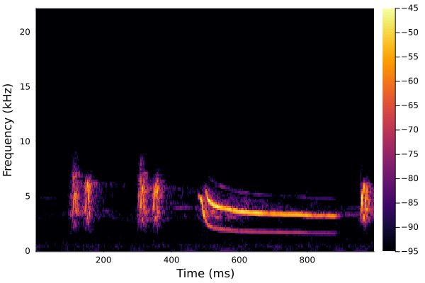
#Plot a spectrogram for the period between 0.5 and 1.5 seconds
specgram(x[0.5:1.5s])
savefig("myspectrogram.png")
Getting the time-frequency-distribution for a few select timepoints
To be able to create a plot like on the cover of Unknown Pleasures, we need to get to the raw data behind the spectrogram shown above. To do this, we use the functiontfd(x, kernel), which calculates a time-frequency-distribution for a signal based on a kernel (which can be thought of as precise instructions on how to do this).
# Calculate the time-frequency distribution
y = tfd(x, Spectrogram())
This spits out a bunch of numbers. To make sense of them, we can inspect the y-object (struct in Julia lang), which has three different fields.
Tip
Typing
y.into the REPL and then pressingTABwill list the fields.
y.time is a vector holding the timepoints in seconds at which the distribution was calculated, y.freq lists the frequencies for which intensities were calculated and y.power gives the intesities for these frequencies:
129×12763 Matrix{Float64}:
 1.76096e-10  4.66534e-11  5.04949e-10  …  1.00139e-9   2.27608e-10
 3.67186e-10  4.70608e-10  9.93315e-11     2.30043e-10  1.28255e-10
 3.57708e-11  1.06503e-10  2.03054e-12     1.59702e-10  6.10792e-10
 8.84663e-10  4.86165e-11  4.5629e-10      2.25818e-10  4.06268e-11
 1.63534e-10  3.0644e-11   6.59856e-12     4.03055e-11  2.87702e-10
 5.85431e-11  3.69034e-10  4.20965e-11  …  1.41581e-10  9.80806e-10
 2.25224e-12  5.14565e-11  1.51812e-10     6.04325e-10  3.37664e-10
 1.21573e-10  5.98798e-11  4.01817e-11     1.60438e-10  2.11216e-10
 1.09466e-10  1.5148e-10   3.95545e-11     1.69113e-11  5.93698e-10
 5.30399e-11  2.06067e-11  6.13965e-11     2.93299e-10  5.68368e-10
 ⋮                                      ⋱
 6.37583e-12  2.30836e-12  2.23539e-11  …  2.83812e-12  4.87521e-11
 2.14007e-11  1.97387e-13  8.69269e-12     1.8047e-11   7.49625e-12
 5.43196e-12  9.80032e-12  5.82842e-12     4.18682e-12  1.16439e-11
 2.65177e-11  1.00923e-11  1.73167e-12     1.13548e-11  3.8452e-11
 2.42328e-13  1.78008e-11  3.07206e-12     8.47381e-12  7.95944e-12
 1.1213e-11   9.15752e-12  3.97983e-12  …  1.11962e-11  9.21441e-12
 2.2352e-12   1.62016e-11  5.74801e-13     1.48062e-11  1.43169e-11
 7.89611e-12  9.41155e-12  1.87152e-11     1.00743e-11  2.83402e-11
 1.20787e-12  9.62267e-13  2.32845e-12     2.96996e-15  9.36932e-12
Note that the dimensions of y.power (129x12763) match the dimensions of y.freq(129) and y.time (12763).
To get a better understanding of y, we can plot it using plot(y), and this will produce a plot very similar to the one shown above using specgram(x) (in fact the latter function is just a shortcut).
We can get frequency distributions for individual timepoints by accessing y.powerdirectly:
# Get the first frequency distribution
y.power[:, 1]
This gives us an array that is 129 elements long, exactly what we would expect based on the 129 different frequencies that were analysed, and precisely what we will need to get our Unknown Pleasures-plot.
Plotting
For the following plots, we’ll use a different package called CairoMakie, which allows us to better customise our plots..
# Load CairoMakie
using CairoMakie

# Activate it as plotting backend and set it to save plots as svg
CairoMakie.activate!(type = "svg")

# Initialise a figure with a black background measuring 300px by 300px and with 50px of padding
f = Figure(backgroundcolor = :black, size=(300,300), figure_padding=50)

# Initialise and axis object to plot onto. f[1,1] tells it to be the only one in the plot. Leave out labels and make background black
ax = Axis(f[1,1], xlabel="", ylabel="", backgroundcolor = :black)

# Remove any decorations (grid lines, axis labels, etc.)
hidedecorations!(ax)

# Plot a white line graph of y.freq against y.power[:,1] onto ax
lines!(ax, y.freq, y.power[:,1], color = :white)
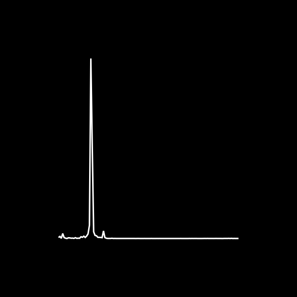
The result looks neat, but highlights an obvious issue: there’s one massive peak, which we’ll need to reduce in height, before we can proceed to stack different lines. With an end in sight, I’ve wrapped everything into a function, included a normalisation step to adjust the maximum peak height and added variables for controlling the time and frequency windows, as well as the number of lines to be drawn:
function plot_unknown_pleasures(
	filename::String;
	tmin = 0s,
	tlen = 0.5s,
	fmin::Int = 1,
	fmax::Int = 129,
	n_lines::Int = 20,
	scale_y = 1/5
)
	frequency_window = fmin:fmax
	x = signal(filename)[:,1]

	# Calculate Spectrogram
	y = tfd(x[tmin:tmin+tlen], Spectrogram())
	xdata = y.freq[frequency_window]

	# Get an array of evenly spaced, n_lines-long array indices for y
	sample_range = round.(Int, collect(LinRange(1, length(y.time), n_lines)))

	# Sample frequency powers
	sampled_power = y.power[frequency_window, sample_range]

	# Re-scale the sampled powers, such that the maximum reaches to
	rescaled_power = sampled_power./maximum(sampled_power)*(n_lines*scale_y)

	# Set up figure and ax
	f = Figure(backgroundcolor = :black, size=(300,300), figure_padding=50)
	ax = Axis(f[1,1], xlabel="", ylabel="", backgroundcolor = :black)
	hidedecorations!(ax)

	# Loop over number of samples
	for i in 1:length(sample_range)
		# Add an increment to offset the stacked plots
		ydata = rescaled_power[:, i] .+ i
		# Plot
		lines!(ax, xdata, ydata, color = :white)
	end
	f
end